Ultimate Activity Camps
Experience Ultimate Fun
Brand identity
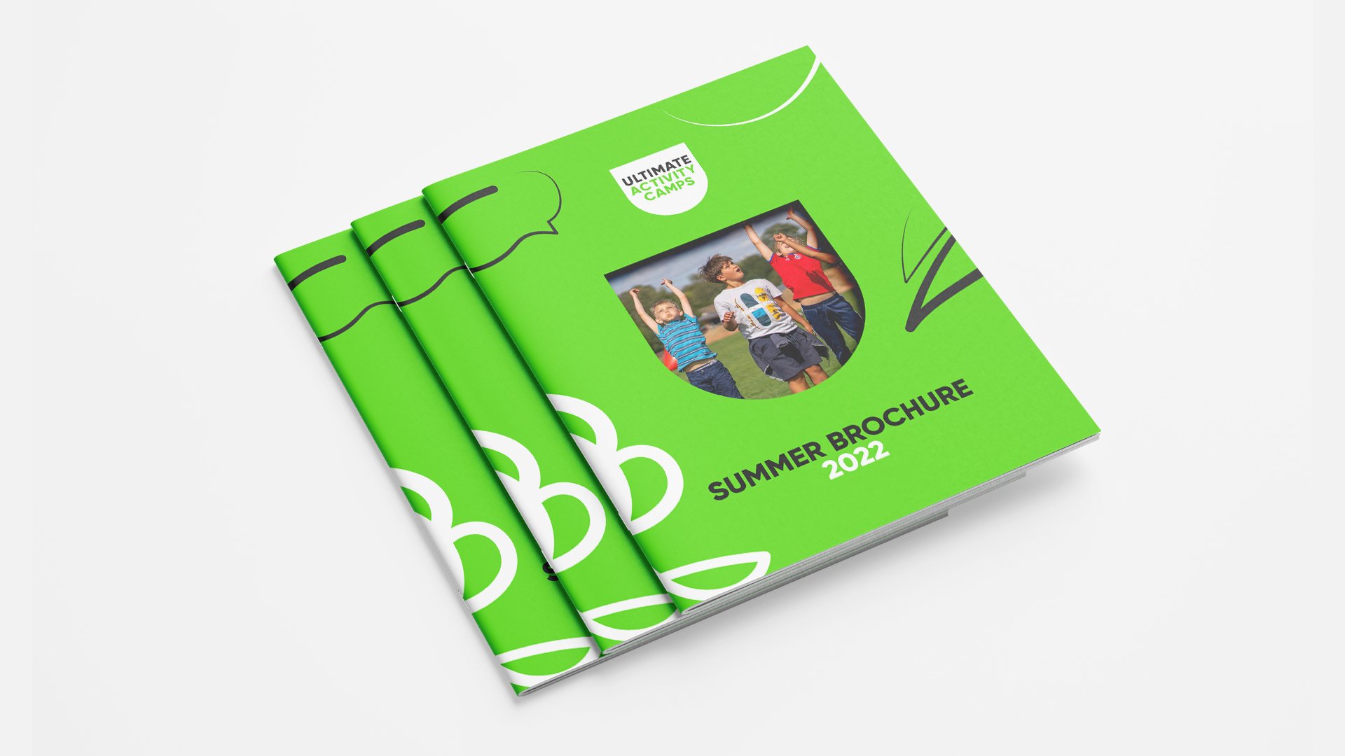
Brand guidelines
Website design
Animation
Ultimate Activity Camps is a premium, Ofsted registered, activity camp provider for children between the ages of 4 and 14 from all over the world. With 25 years of experience, they have earned themselves a strong reputation for providing a best-in-class experience balancing fun and safety at only the best locations.
UAC came to Gendall to refresh their brand identity after a decade of growth, helping them live up to their reputation and drive their business forward.
The energy within U
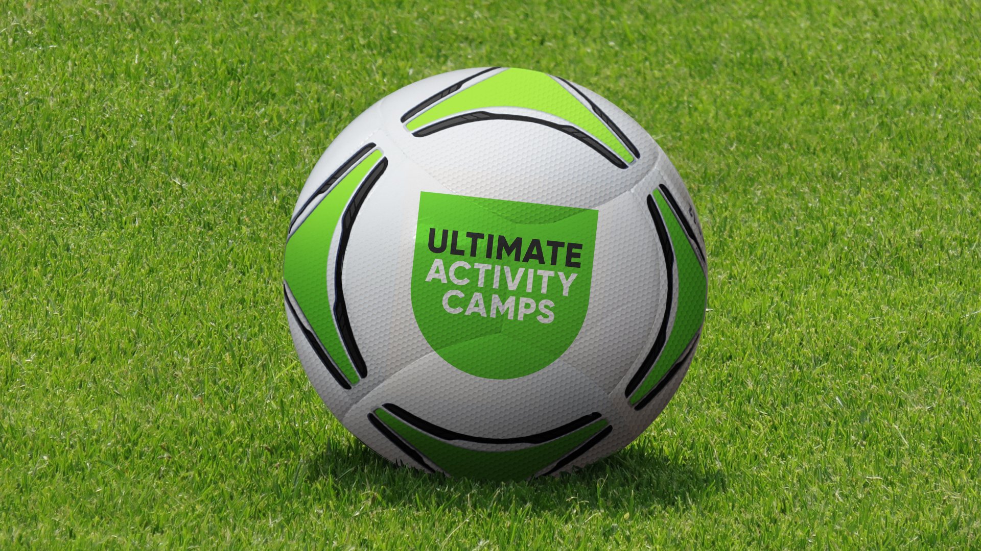
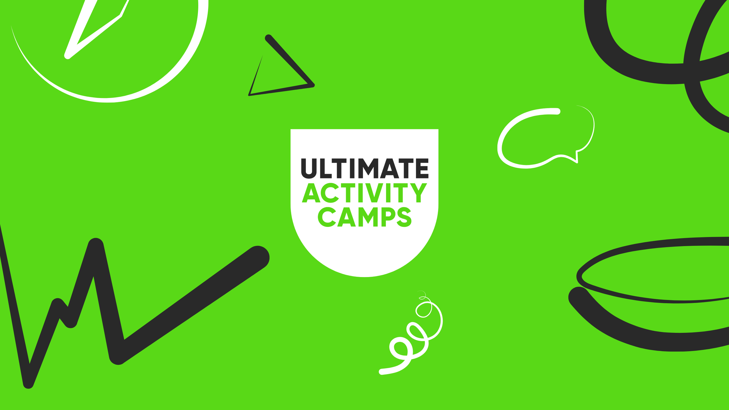
Our brand concept is made up of two strands. One is the simplistic emblem, or crest shape, simplified to the point where it can both be read as the letter ‘U’ and be a window to the world of Ultimate Activity Camps.
The second strand was the representation of the energy experienced at the camps in the form of lines that create motifs, representing the variety of day camps that UAC offer. The way these lines interact and interplay with the U shape bring to life the brand experience.
Our re-brand work was a smooth (and enjoyable!) experience as the team at Gendall took the time to really understand our business, our customers and branding needs. The creative output was spot on and we had very positive feedback from stakeholders across the Dukes Education group.
Luke Hayward
Managing Director


Ultimate flexibility
In order to provide a design system that can grow and develop into sub brands and work across the variety of communications throughout the year, the framework of the visual identity is as simple yet the scope in which the concept flexes provides endless opportunities with not only the window device but also the energy line illustrations. This comes into its own when refreshing comms pieces with new activities and a variety of advertising executions.